So, you’ve launched your website. It looks nice, you love your brand, and everything feels ready. But there’s a problem , people are visiting your site, and they’re not doing anything. No clicks, no sign-ups, no sales. What’s going wrong?
The truth is, even a good-looking website can fail if a few important things are not done right. Let’s look at some of the most common mistakes that stop your website from turning visitors into customers.
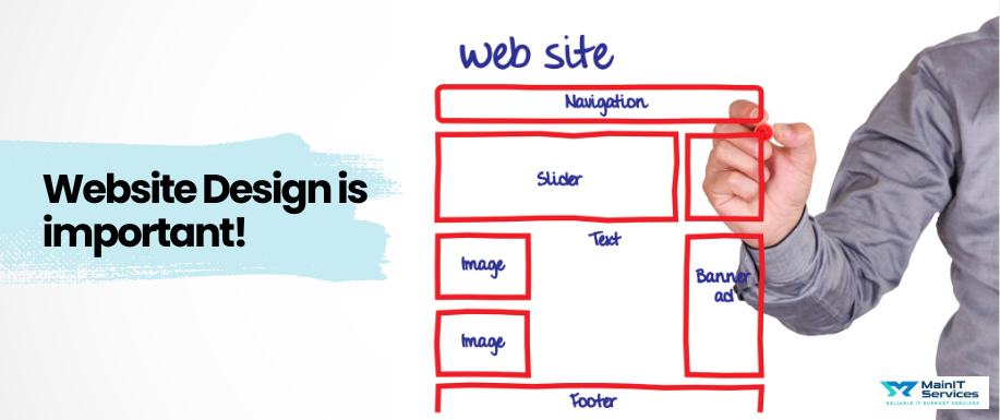
1. Confusing Navigation
If people don’t know where to click or how to move around your site, they will leave quickly. Keep your menu simple. Use clear words like “About Us,” “Our Services,” or “Contact Us.” Don’t try to make things messy. A clean, easy-to-follow menu helps people feel comfortable and stay longer on the site.
Think of your website like a store. If someone walks in and can’t find the counter or the products, they’ll leave.
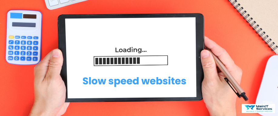
2. Slow Loading Speed
Visitors don’t like to wait. If your website takes more than a few seconds to load, many visitors will close it and never come back. You can fix this by:
-
Making your images smaller in size
-
Removing things your site doesn’t need like extra content, extra files , images also minify the use of css and javascript.
-
Checking your website speed regularly
Even one extra second can make a big difference turning visitors into customers.
3. No Clear Call to Action (CTA)
A “Call to Action” is what you want visitors to do next like “Buy Now,” “Call Us,” or “Get a Quote.” If you don’t clearly show this, people will just scroll and leave.
Make your CTA easy to see. Use buttons with bright colors and simple words. Every page on your site should guide visitors toward one clear action.
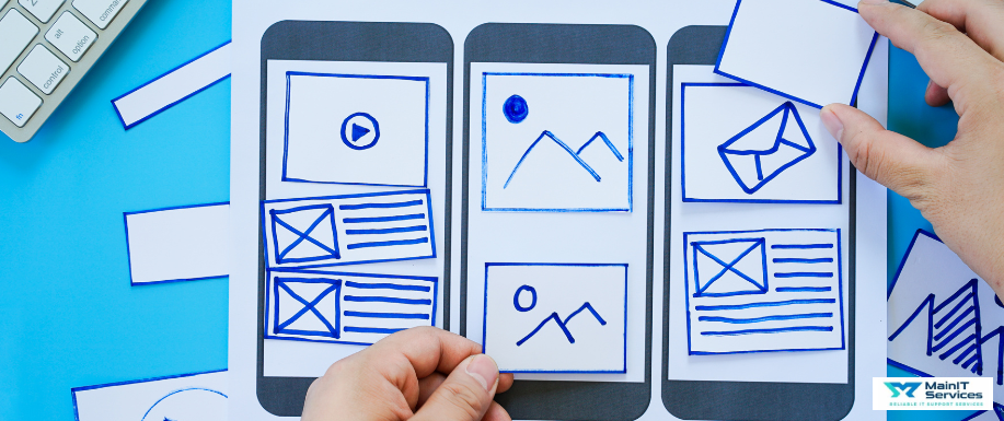
4. Responsive Issue
Many people use phones to visit websites. If your site looks bad on a phone i-e text too small, buttons too hard to press, messy layout people won’t stay.
Your website should work well on all screen sizes: phones, tablets, and computers. Check now each screen size to provide a user friendly experience to visitors.
5. Too Much Text, Not Enough Visuals
Using visuals is important to grab user attention as most people don’t read every word they scan. If your page is just one long paragraph, visitors might feel overwhelmed and leave.
Break up your content:
-
Use headlines
-
Add bullet points
-
Include pictures or icons
This helps people quickly see the most important information.
6. Too Many Distractions
Pop-ups, moving images, and auto-playing videos can be more annoying than helpful. Your design should guide the visitor, not confuse them.
Keep it clean. Use empty space (white space) to give the page a calm feeling. Focus attention on what matters.
7. No Trust Signals
Before someone gives you their money or email, they need to trust you. If your site doesn’t show things like:
-
Customer reviews
-
Testimonials
-
Security icons
-
Contact details
Conclusion
Your website should do more than just look nice, it should help people take action. If your site has one or more of these problems, fixing them can make a big difference.
Sometimes, you don’t need to add more. You just need to make what you already have better.
Want to build a high-converting website from start to finish?
Read our full guide here
.png)